Filter Dropdown Menu
Build a responsive dropdown menu for applying filters to a list.
Environment
Use the environment you are most comfortable with. Because the React docs site suggests using a full-stack React framework, these challenges use the most popular of these frameworks, Next.js. You can run
npx create-next-app@latest
from your terminal to set up a new Next.js project, then use npm run dev to develop locally and inspect the DOM from your browser when debugging. I opt to use App Router, made stable in Next.js 13.4 over the Pages Router. I also use tailwindcss for simple inline styling.
Specification
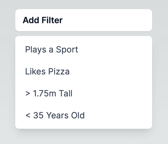
In this challenge, your goal is to create a filter dropdown component using React. The starter code provides a basic structure for the FilterDropdown component. Below are a few images of the finished component followed by the challenge requirements.
Filter Options
The dropdown should display a list of filter options. Each option is represented by a string, and the initial set of options is provided in the FILTERS array.
Toggle Filter
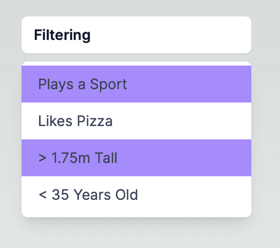
Clicking on a filter option should toggle its state between enabled and disabled. The enabled state should be visually distinguishable, for example, by changing the background color.
Dropdown Toggle
Clicking on the main dropdown area should toggle the visibility of the filter options. When the filter options are visible, the dropdown should display either "Filtering" if any filter is enabled or "Add Filter" if no filters are enabled.
Visual Feedback & Styling
Provide visual feedback to indicate the active state of the filter options. For instance, when a filter is enabled, the background color can change to indicate its status. The solution below also includes color changes when the user hovers over a filter.
Starter Code
Below is a small skeleton of the application to get you started.
app/page.tsx
import FilterDropdown from './FilterDropdown'

export default function Home() {
  return (
    <div className='flex justify-center h-screen w-screen pt-10'>
      <FilterDropdown/>
    </div>
  )
}
app/FilterDropdown.tsx
'use client'

import { useMemo, useState } from "react"

const FILTERS = [
  'Plays a Sport',
  'Likes Pizza',
  '> 1.75m Tall',
  '< 35 Years Old'
]

export default function FilterDropdown(){

  // YOUR CODE HERE

}
Solution
Below is the entire solution code for the component followed by a short explanation of how it works.
app/FilterDropdown.tsx
'use client'

import { useMemo, useState } from "react"

const FILTERS = [
  'Plays a Sport',
  'Likes Pizza',
  '> 1.75m Tall',
  '< 35 Years Old'
]

export default function FilterDropdown(){
  const [open, setOpen] = useState(true)
  const [filters, setFilters] = useState(() => {
    return FILTERS.map((str) => {
      return {
        name: str,
        enabled: false
      }
    })
  })

  const clickFilter = (name: string) => {
    setFilters(filters.map((item) => {
      if (item.name == name) return {...item, enabled: !item.enabled}
      else return {...item}
  }))
  }

  const filtering = useMemo(
    () => filters.find((item) => item.enabled) != undefined,
    [filters])


  return (
    <div>
      <div
        className="w-56 rounded-md bg-white px-3 py-2 text-sm font-semibold text-gray-900 shadow-sm ring-inset hover:bg-gray-100"
        onClick={() => setOpen(!open)}>
        {filtering ?  'Filtering':'Add Filter'}
      </div>
      <div className={`mt-2 origin-top-right rounded-md bg-white shadow-lg py-1 ${open ? '' : 'hidden'}`}>
          {filters.map((item) =>
            <div
              key={item.name}
              className={`text-gray-700 block px-4 py-2 text-sm ${item.enabled ? 'bg-violet-400 hover:bg-violet-300': 'hover:bg-gray-100'}`}
              onClick={() => clickFilter(item.name)}>
                {item.name}
            </div>
          )}
      </div>
    </div>
  )
}
Let's break down the solution code and understand its functionality:
The component uses two pieces of state. The open state is a boolean flag indicating whether the filter options dropdown is open or closed. The filters state is an array of objects, each representing a filter option. Each object has a name property (the filter text) and an enabled property indicating whether the filter is currently active.
The clickFilter function toggles the enabled state of a filter when it is clicked. It uses the setFilters function to update the state by mapping over the existing filters array. Importantly, map returns a new object. If the element to be updated in the filters array was changed directly and array passed to setFilters was the same as the previous array, react would assume the state was not changed, and the next render would not reflect the change.
The filtering variable is a memoized value that indicates whether any filter is currently enabled. It relies on the useMemo hook to compute this value only when the filters state changes.
The FilterDropdown component renders a div containing two nested divs. The first div serves as the main dropdown area. It displays "Filtering" if any filter is active and "Add Filter" otherwise. Clicking on it toggles the visibility of the filter options. The second div contains the actual filter options, each represented by a div. The styling and interactivity are applied using Tailwind CSS classes.
As a follow-up challenge, display the list of active filters in a search bar instead of the "Filtering" text currently in place. Allow the user to remove them by clicking on them in the search bar.